Elliot Hayes / Property agent
A home in view.
A person to connect with.
The house gets the first word. Soft serif lettering and a bright citron accent bring a personal touch to the practical details.
Open the working website ↗
 A personal approach to property.
A small signature.
Easy to recognise.
The lettering
A little expression.General Sans keeps the details clear.
Instrument Serif adds a softer voice to the larger headings. The open-gate EH mark stays simple enough to work small.
#EFF14ECharcoal #27251EWarm white #F6F3F0Villa Solano / A closer look
The room comes first.
Each residence has four photographs. Open one to see its full proportions, then return to the same place in the page. The name, room counts and next step stay nearby.
Explore Villa Solano ↗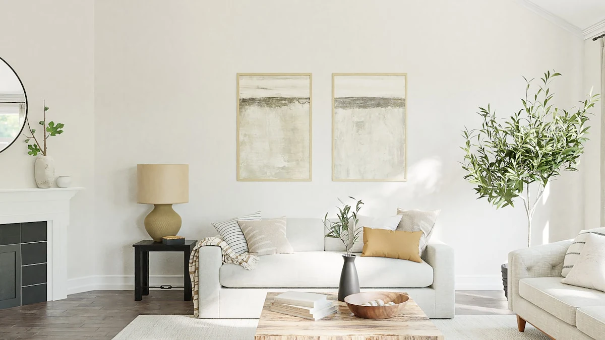
Go a little further
One website.
Different places to start.
Search the collection, open a residence or read a design note. The same navigation connects every page.
Have a business
that needs a better introduction?
Send the idea or the website you have now. We can work out a useful place to start.
hello@elevorflows.com ↗Reference: EstateAgent by Clariv Studio. Reference photography retained. ELEVOR created the Elliot Hayes identity, frontend, writing and presentation. This portfolio website does not offer property brokerage services.